
Elevate Branding with a Custom Color Palette
Your brand is the first impression that people will have of your company, and like it or not, it’s going to get judged. In fact, according the the Institute for Color Research, people form an opinion about your content in less than 90 seconds, and up to 90% of that judgement is influenced by brand color palette. Creating a stellar first impression is KEY no matter what stage of business you are in, and creating a color scheme for your brand shouldn’t be taken lightly.
Brand recognition is crucial for a successful company, and color is one of the easiest ways to implement consistency across all of your visual media. Blogger Neil Patel lends further proof of the importance of color, divulging that color increases brand recognition by up to 80%! Truly excellent branding should be so dialed in and consistent, that your customer’s could look at your web or print collateral without your logo or business name present and still know and recognize your brand.
Creating a brand color scheme is vital, however developing a great color palette isn’t as easy as it may seem. Many people are quick to just throw together some colors they like or think look good together and roll with it. Unfortunately, they may later find that their color palette doesn’t resonate with their audience and/or is ineffective at creating compelling visuals. This may seem overwhelming, but developing a color strategy up front will make developing the rest of your branding and visuals a breeze.
Display Your Company’s Values Through Color
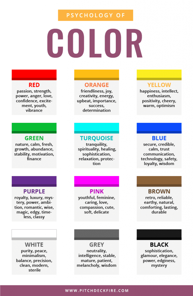
As we wrote in a previous post, branding is all about creating an emotional tie with your customer. There is little that evokes more emotion than color and imagery. Colors each have emotional responses attached to them, and by utilizing color wisely you can convey the tone or personality of your brand instantly. It isn’t enough to just choose colors that you like, or that look cool. Instead, you should choose colors that give people emotional cues about who you are as a company, and what you represent.
Take a minute to write down a few of your company’s key values, or the primary mood that you want to convey to your audience. Next choose a color that matches that same tone. This color will be the primary or action color for your brand, and will be the dominant color across all of your visual media.
To help you choose, here is a list of colors and the moods they represent.
There are also specific words associated with colors. In a survey, participants were given a word and told to choose the color they felt represented it best.
- Fun: Orange 28%, Yellow 26%, Purple 17%
- Security: Blue 28%, Black 16%, Green 12%
- Trust: Blue 34%, White 21%, Green 11%
- Speed: Red 76%
- Fear: Red 41%, Black 38%
- Courage: Purple 29%, Red 28%, Blue 22%
- High Tech: Black 26%, Grey 23%, Blue 23%
- High Quality: Black 43%, Blue 20%
- Reliability: Blue 43%, Black 24%
This is a rather simplistic view of color psychology. It should give you a good idea of what color best represents the feel of your business.
Understanding Color Theory
Once you have chosen using the guide above, you can begin to develop a full color palette. While we won’t get into every nitty-gritty detail of color theory, there are a few basic principles that will ensure your colors work well together.
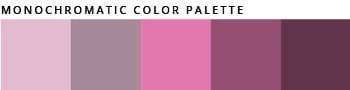
Monochromatic palettes consist of several shades, hues, tones and tints of the same color. When done well these types of palettes can be extremely effective, however they can also leave design looking flat and lifeless.

Analogous schemes are groups of three or more colors that are next to each other on the color wheel. These palettes tend to be extremely versatile because the three colors will share similar qualities, which makes it easy to convey tone.

Complementary palettes are made up of colors that are on opposite sides of the color wheel. As the name implies tend to be incredibly complementary. You can use the exact colors on the wheel, or times or shades of those two colors.

Split complementary palettes are similar to complementary palettes. But instead of using the color exactly opposite, you choose the colors on either side of the color that is opposite your main hue

Triadic palettes use colors that are evenly spaced around the color wheel. These palettes provide excellent punch and contrast. But can be too much for certain brands as they can get busy quickly.
Creating Your Color Palette
Using the color theory guides above is a great starting point, but there are a few other things to consider.
Primary vs. Secondary Palette
Keep your primary palette simple, utilizing around 3 primary colors for most of your brand. This keeps things clean and professional. It allows you to call attention to your key points or call to actions without being distracting.
Build out a secondary palette of complementing colors for when you need a little more. These colors are great for complex illustrations or accent colors.
Don’t Forget Neutrals
Neutrals include black, grey, whites, and creams. No, these colors aren’t particularly exciting, but the are critical for grounding your design.
Tools and Resources
There are some great tools out there for helping non-designers create color palettes.
coolors.co is one of my favorites and allows you to generate and export color palettes
colourlovers.com lets you build palettes and search popular palettes based on industry
These are the basic guidelines for developing an effective brand color strategy! If you need some guidance, hiring a brand designer. It is an excellent idea as they are well versed in all of the ins and outs of color theory. You’ll be able to elevate your brand and color strategy to truly resonate with your company and customers.