So you spent the time and money and invested in a killer brand identity and now you you’re eager to show it off! You may decide to make a few flyers or business cards and toss your logo and colors on it and call it a day. While this approach can work in a pinch, you really want to make sure you use your stunning new brand to its fullest potential, and for your brand to work it needs to be consistent. Consistency in branding is KEY for building customer trust and loyalty and shouldn’t be underestimated. You want to ensure that any materials, both print and digital, that you produce follow your brand guidelines to the tee. The easiest way to set your company and your brand up for success for years to come is through the use of a brand style guide.
So what is a Brand Style Guide?
A brand style guide is basically a cheat sheet for your brand. You can look at it easily and ensure that any materials developed match your brands values and aesthetics. You may think you know your branding super well, but what about when you hire employees… or outsource design work to a firm? A branding style guide let’s anyone who views it grasp the ins and outs of what makes your brand yours, and will ensure consistency no matter who is doing the design work!
What should be on a Brand Style Guide?
A brand style guide can be as simple or complex as you want to make it. For many companies, they find a single page document like the one below to be more than adequate. Others have style guides that are vastly more complex. Whichever you choose, make sure that it encompasses all the elements and styles that are crucial for your branding consistency. We’ll go over some of the basics for a simple style guide here.
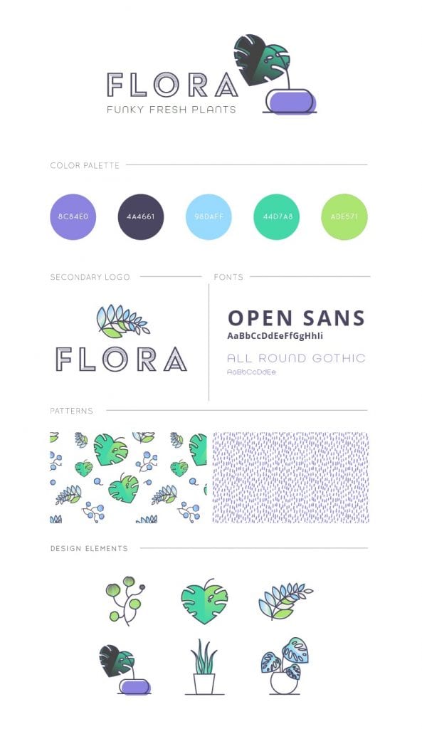
Primary Logo
Your primary logo is just that… primary. It is the main logo for your business and is normally featured at the top of your style guide. This logo will be used the most frequently throughout your branding and will be the touchstone with your audience.
Alternate Logo or Logos
An alternate logo is a variation of your primary logo that has a slightly different look. This could be for orientation reasons such as a longer logo versus a more vertical or stacked logo. This could also be to jazz up your brand a bit, adding additional taglines or iconography or colors.
Submarks and/or Watermarks
Submarks are additional variations of your primary logo. These tend to be very simple versions and can be used for social media pictures or favicons. Don’t stress if your brand doesn’t have one of these yet, you can always develop one later or be totally fine without it!
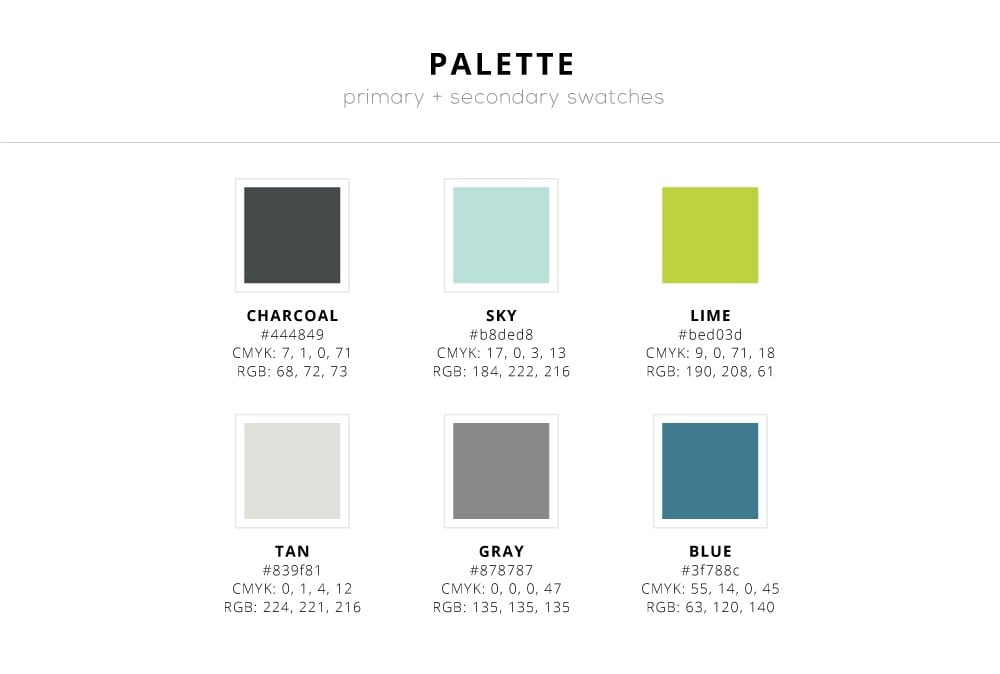
Color Palette
Color is one of the easiest ways to implement brand consistency. In fact, a study has even shown that color increases brand recognition by up to 80%! This can include a simple color palette, or a more extended color palette with secondary accent colors. To make it easier for you and designers you may hire in the future, include the Hex code for each color on your palette. Hex codes are a 6 digit code of letters and numbers that tell your computer EXACTLY what color you want.
Fonts
A good branding style guide should include fonts and when/ how to use them. I recommend using no more than three fonts as too many can look chaotic and unprofessional.
Font 1 is your primary font and should be used for all of your headings.
Font 2 is your accent font or secondary font and can be a little jazzier. This works well for subheadings and accents.
Font 3 is your body font and will be used for all blocks of text copy. Keep this one SIMPLE.
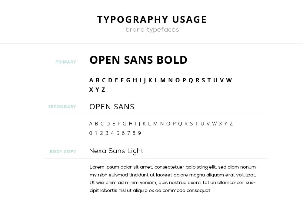
Pick fonts that work well together but don’t overpower each other.
Patterns
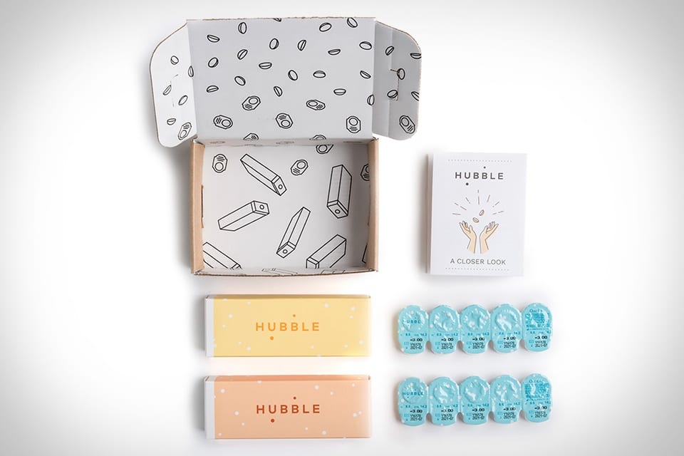
If your brand uses patterns they will be located here as well. Patterns can be a great way to showcase your brand and make it stand out! Custom patterns look amazing on packaging and can really give it extra pizzazz. Adorable custom patterns even make contact lenses fun and exciting
Design Elements
Design elements are custom icons or graphics that enhance your brand. By making sure these are all the same style and using them across multiple platforms they will help reinforce your brand identity!
These design elements are commonly seen as icons or custom buttons and will carry your branding style throughout every medium!

Now Use It!
Remember to use your style guide as a point of reference to make sure you follow consistent branding guidelines throughout all of your work!
Whether you are the one doing the designing or you’re hiring out help, developing and using a killer style guide will ensure deliverables that don’t just represent your brand, but truly embody it!