Choosing a color scheme for your logo and branding is key to the overall success of the design. Unfortunately, it can also be one of the hardest parts of the process. Luckily, there’s a set of design principles that will help you pick a congruent and effective color scheme with color wheel combos for your logo.
How to Pick an Action Color
The simplest way to start developing your color palette is to pick one action color and work from there. You may think this is as easy as opting for your favorite color and calling it a day, but you’d be wrong! Take the following points into consideration when choosing your action color.
Psychology
Each colors has an emotional response attached to it. By using color wisely you can convey the tone or personality of your brand instantly and intuitively. It isn’t enough to just choose colors that you like, or that look cool. Instead, you should choose colors that give people emotional cues about who you are as a company, and what you represent. Read more about the psychological properties of color here.
Tone
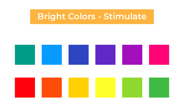
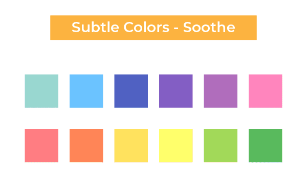
Angela Wright, a world-renowned color psychologist, has shown that it’s not simply a color that affects your behavior, but how intense that color is.
“What defines whether a color is stimulating or soothing is not the color, it’s the intensity. A strong bright color will stimulate, and a color with low saturation will soothe.”
Pick a color using the color psychology methods above, and then decide whether you want to excite or soothe. That will help you pick the exact hue or tint of the color that resonates with your brand best.
See this visually in the images below. There is no difference in the colors in each image other than the saturation level. See what a big difference intensity makes?
Consider Your Market
When picking colors for your logo, you want to make sure they are appropriate for your market. For instance, a children’s clothing store can get away with using neons and an overall varied palette, whereas an accounting firm may want to stick with something muted to convey seriousness and professionalism.
You’ll also want to think about competitors in your market sector. Standing apart from the crowd is hard enough, and will be downright impossible if you’re using the exact same shade as your direct competitor! Do a little market research and select a color that resonates with, but is also not overrepresented in, your industry.
Build Your Palette with the Color Wheel
So you’ve selected your action color, and it’s time to build a palette around it! Unfortunately, you can’t just pick a bunch of colors you like and expect them to work well together. You may find yourself with a mismatched brand that lacks cohesion and direction. Luckily, there is a handy tool that can help you pick colors that work perfectly together. It’s called the color wheel, and using it effectively will help you create an amazing and cohesive color palette for your logo!
There are a few “recipes” for the color wheel that will help you create the perfect color combinations. We’ll take a look at a few of them below.

Monochromatic
Monochromatic palettes consist of several shades, hues, tones and tints of the same color. When done well these types of palettes can be extremely effective, however they can also leave design looking flat and lifeless.
The animal planet logo is a great example of this style. Various shades of green create a simple but eye-catching logo.
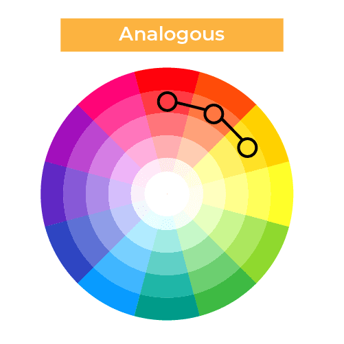
Analogous
Analogous color schemes use colors that are found next to each other on the color wheel. The analogous palettes have a slightly monochromatic look with a little extra punch.
These palettes can be extremely sophisticated and beautiful. But sticking to one shade may be a bit too subtle at times. Consider a complementary color as an accent to make a particular item stand out (like a call to action or a “buy now” button).
This logo is a great example of an analogous color scheme using pinks and purples that are next to each other on the color wheel.
Complementary Color Palette
Complementary palettes are made up of colors that are on opposite sides of the color wheel. As the name implies, they tend to go incredibly well together. You can use the exact colors on the wheel, or tints or shades of those two colors.
Complementary palettes make things truly stand out, as it creates high contrast. This is great for accenting important calls to action, but should be used sparingly. Too much contrast can be visually jarring for your viewer.
In order to make sure it is effective and not jarring, use your two colors in a 75% to 25% ratio. This ensures that the 25% color will make your chosen elements truly pop, without being overly distracting.
Visa is a great example of using complementary colors and the 75/25 rule. Blue is the primary color, with its complement of orange used for a pop.
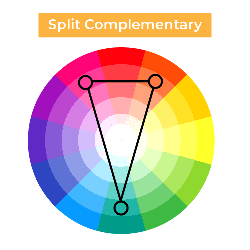
Split Complementary
Split complementary palettes are similar to complementary palettes, but instead of using the color exactly opposite, you choose the colors on either side of the color that is opposite your main hue. This is a way to get the benefits of a complementary palette, while adding in a third color. One color will serve as your primary color, with the other two acting as accents.
The Taco Bell logo uses a split complementary palette for a truly eye-catching logo.
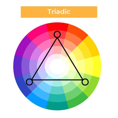
Triadic Palettes
Triadic palettes use colors that are evenly spaced around the color wheel. These palettes provide excellent punch and contrast, but can be too much for certain brands as they can get busy quickly.
The Popsicle logo is a great example of this palette. It uses blue, red, and yellow, which are evenly spaced around the wheel.
Experiment with the methods above, and you’ll to develop a beautiful logo and a cohesive color palette to grab the attention of your target audience!