How Do I Choose the Correct Font for My Pitch Deck? (Comprehensive Guide)- Summary
- What is a Font?
- How Do Fonts Apply to my Brand?
- How to Customize Your Brand Image with the Right Font’
- How to Understand the Difference Between Fonts
- How Many Types of Fonts are There?
- Overview of Serif vs Sans Serif
- When should I use Serif vs Sans Serif?
- How do Fonts Fit into my Pitch Deck?
- Make Sure You Have the Font Files on Your Computer
- How to use your Font Files to Edit and Update your Pitch
- Wrap-up
What is a Font?
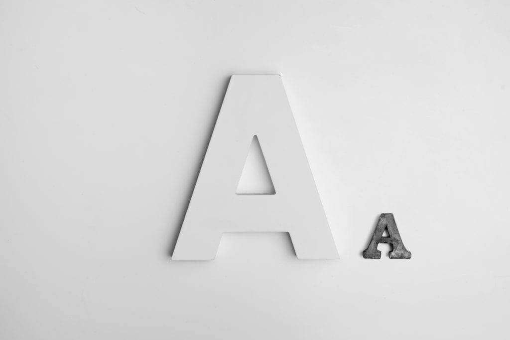
A font is a style of text that gives a unique appearance to each letter. Letters written in different fonts are distinctly different from each other, but they have the same style and appearance as all the other letters and numbers in the same font group. If you’re putting together a PowerPoint presentation for your pitch, the font is the way that the text actually looks. Arial looks very different than Times New Roman.

How Do Fonts Apply to my Brand?
Ultimately, the font you choose for your brand will be what you use to write your messaging and develop your signage and marketing material. The font’s most important job is to be consistent and brand-aligned while conveying your message in an effective way. The font needs to be visually appealing and it needs to fit with the rest of the design.
How to Customize Your Brand Image with the Right Font
Sometimes fonts do and don’t fit your particular company’s aesthetic and appeal. In your branding, you might have the need for specialty fonts. Many of our logo and branding clients look for their own unique fonts or work with our designers to select fonts that are a good fit for your company’s brand image.
When you work with a designer they will often ask if you have specific fonts you want them to use. And they may or may not choose new fonts for you that better fit your brand or the material being developed.
How to Understand the Difference Between Fonts
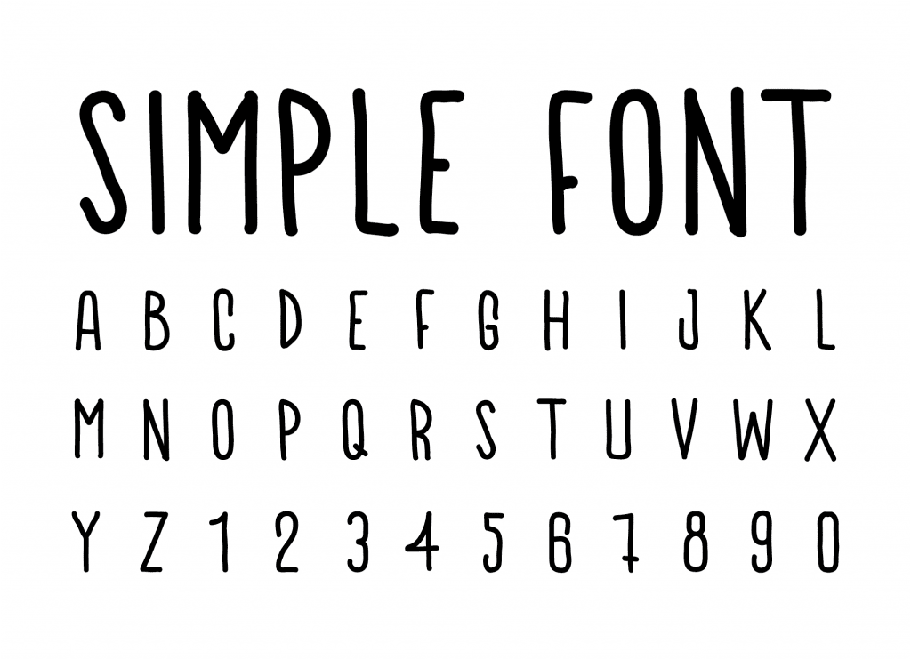
Open any word editor or PowerPoint and change the font of a sentence to the very funky Comic Sans or the very standard Arial font. The two are extremely different from each other. There are both cursive and print fonts and handwritten fonts. And there are even fonts with nothing but icons/images. There are so many different types of fonts you can use and every type of software you use to put together a presentation comes equipped with some standard fonts. You can always add to your available fonts as needed.
How Many Types of Fonts are There?
Although there are probably millions of variations of fonts, there are basically two core types of fonts: Sans Serif and Serif. Now I’m sure there are probably some hardcore font experts out there who would argue with this, but for a business discussion on fonts, these are the main two and most important categorizations of fonts. We’re not going to go into all the detail behind all the variations because we really don’t need to get into the nitty gritty here – we need to build a stellar pitch deck, get funding and get back to our customers, right?

(Source: Wikipedia)
Overview of Serif vs Sans Serif
Serif is the flare or the additional styling added to the basic letter form of the font.
Sans serif means it doesn’t have that additional styling and the font is closer to the actual structure of the basic letter or number.
When should I use Serif vs Sans Serif?
Primary Uses for Serif
Serifs can be very valuable because they help the eye to follow along a line of text. If you’re reading something in print, serif fonts can be really valuable because they help to move the eye along the page and through the content without getting lost or tired. So it’s great for long-form paragraph style text.
Primary Uses for Sans Serif
When we don’t have lines or long-form content, Sans serif is usually a better fit.
That said sans serif tends to be a better fit for online formats because we read and interpret things differently with our eyes online. Sans serif is the font you see most often in a digital context. Think Apple’s iconic Helvetica. Sans Serif it’s traditionally used on the web. It’s a very simple font; it’s very clean lined.

How do Fonts Fit into my Pitch Deck?
At Pitch Deck Fire, we’re big fans of some very basic sans serif fonts when building our pitch decks. Open Sans is a big one. Roboto is also a good one. Apple uses Helvetica a bunch. Arial is a pretty standard font for PC’s. There’s some very simple and basic sans serif fonts that can be very valuable for most brands in putting together their pitch deck or marketing collateral.
Generally speaking, when you’re putting together a pitch deck you’re going to be using it in one of two ways:
- You’re either going to be sending it as a send ahead visual and written document.
- Or you’re going to be presenting it live as a visual aid behind you when pitching.
How to use Font in Send Ahead Pitch Decks or One Pagers
If you’re sending it as a visual document you’re more than likely sending that as a PDF. It’s the standard file format for pitch decks sent via email these days. It’s going to be on the computer. You’re sending it to somebody who will be reading / reviewing the file on their computer or smart phone. You might also be hosting it on a site where the document will be accessed, you guessed it.. online on with a computer. For this format, sans serif is the way to go.
How to use Font in your Pitch and Investor Presentations
When you’re presenting you want the font to be sans serif in most cases. You don’t want serifs on that because the font will be very big and serifs can be distracting in a large format. Our goal with the entire pitch deck is to make it simple and easy to understand. The font therefore, needs to be very simple and not too complicated on the slide. For this reason, we err on the side of sans serif when we’re creating presentations for our clients here at Pitch Deck Fire.
If for some reason you’re going to be printing out your pitch deck, or you plan to have large paragraphs of font on your deck that you’re sending ahead, you may consider the serif fonts. But generally speaking I would say for pitch decks err on the side of sans serif. If you choose to use serif fonts this is why you always want to have two decks and not take a one size fits all approach. Anything that distracts or makes it harder to grasp your message is likely to hurt and not help you when you are courting investors and working to gain buy-in and funding.
Make Sure You Have the Font Files on Your Computer
If you’re getting your pitch deck designed by a designer make sure you get the font files they use because sometimes you won’t have them standard on your tools or they a unique to that design group. Every designer should be able to provide you the particular font files that match the font that best fits your aesthetic. At Pitch Deck Fire, each of our final products come standard with the right font for your brand and pitch. We also provide you the font files for all of our custom created pitch deck, logo/brand, website, and print or digital collateral. This is really important to get from whoever you’re working with because you’ll need these files for the future!
What Happens if I don’t have the Font File?
If you don’t have fonts downloaded, your computer is going to change the font to the closest match. Close matches will not be exact and spacing and the overall look, and layout will all be negatively impacted. Every font is different. Each has a different width of a letter, a different height, and other styling differences in the font. Those differences are going to make things get all wonky and messed up on your PowerPoint presentation. Words will fall off lines, hit the edges of the page, and otherwise become unreadable or un-aesthetically pleasing.
In short, things will get very messed up and the presentation could look very bad and un-presentable.
How to use your Font Files to Edit and Update your Pitch
To keep this from happening make sure you have your font files in hand. Download them into your computer in order to see, edit, and use those fonts in your PowerPoint presentation, keynote, or word document.
Not having the font on your computer will NOT affect PDF’s or documents that are saved in a PDF format. But it definitely WILL affect a presentation in PowerPoint or in Keynote. So you’re going to need to make sure if you’re given a font that you download that font onto your computer before you open up the presentation files. You need to do so to ensure you are able to see, use, and edit that file as you need to.
Wrap-up
If you have any thoughts on font that you’d like to share we would love to hear about it in the comments below. Are you a font expert? We invite you to further educate our readers on how fonts can help make a great pitch and marketing material even better.
If you have any ideas for upcoming pitch hacks we have a link down below as well. I’d love to hear your ideas so we can answer them in an upcoming blog or video. We do new blogs and videos every single week. So if you want to find out more about our upcoming pitch hack videos give us a little thumbs up or subscribe.
Happy pitching!
Suggest an Upcoming Pitch Hack here: https://info.pitchdeckfire.com/pitch-hack-suggestions
For even more pitch hacks visit us here: https://resources.pitchdeckfire.com/tag/pitch-hacks
**Subscribe for more Pitch Hacks in your inbox every week**
Need help with your pitch? Pitch Deck Fire specializes in pitch deck design and presentation preparation. Sign up to speak to a project lead about your pitch deck, sign up here: https://pitchdeckfire.com/pitch-deck-project-initial-steps/
Seeking funding or preparing for a pitch? Find more resources, check out our other helpful articles and posts here: Resources.PitchDeckFire.com


